This blog post is the second in a series of pieces around data visualisation that will be shared on the SAGE Campus blog throughout May. They have been created by Andy Kirk, a UK-based data visualisation specialist, design consultant, training provider, lecturer, author, speaker, researcher, editor of an award-winning website, and course instructor on Introduction to Data Visualisation.
Every week in May we will be sharing Andy’s observations from his 'little’ of visualisation design blog series. This week’s post covers labelling. Stay tuned throughout May for further posts on annotations, axis, and photo-imagery.
This is part of a series of posts about the 'little of visualisation design', respecting the small decisions that make a big difference towards the good and bad of this discipline. In each post I'm going to focus on just one small matter - a singular good or bad design choice - as demonstrated by a sample project. Each project may have many effective and ineffective aspects, but I'm just commenting on one.
Andy Kirk
CLEVER LABEL PLACEMENT
The 'little' of this design concerns the creative placement of chart labels across a panel of small multiples. The piece in question comes from Zachary Labe looking at the last 70-years of autumn temperature anomalies in the Arctic.
Read Andy’s comments and observations on visualisation design
LABEL ALIGNMENT
The 'little' of this next design concerns the sensible positioning of categorical labels. This Daily Chart, by the Economist's data team, offers a view of the identified political persuasion of people living in selected swing states of America. The chart is a variation of the connected dot plot, with a separate row for each state.
REDUCING UNNECESSARY THINKING
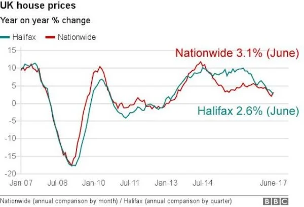
The specific example here comes from a chart published by the BBC in this article about the slowing of the UK housing market. The line chart shows the upwards and downwards trends of two house price trackers changing over time, simple enough stuff until you glance at the x-axis labelling at which point it is quite easy to becoming confused about judging the 'when'.
Read Andy's further observations
Read the next post in this series on chart annotations!
Want to access sage campus? Please visit our institutional page to find out about how your institution can get this content.


