


This blog post is the first in a series of pieces around data visualisation that will be shared on the SAGE Campus blog throughout May. They have been created by Andy Kirk, a UK-based data visualisation specialist, design consultant, training provider, lecturer, author, speaker, researcher, editor of an award-winning website, and course instructor on Introduction to Data Visualisation.
Every week in May we will be sharing Andy’s observations from his 'little’ of visualisation design blog series. This week’s post covers use of colour. Stay tuned throughout May for further posts on labelling, annotations, axis, and photo-imagery.
This is part of a series of posts about the 'little of visualisation design', respecting the small decisions that make a big difference towards the good and bad of this discipline. In each post I'm going to focus on just one small matter - a singular good or bad design choice - as demonstrated by a sample project. Each project may have many effective and ineffective aspects, but I'm just commenting on one.
Andy Kirk
Better Colour Keys
The 'little' of this design concerns a clever approach to squeezing more potential out of your colour keys, as demonstrated by the project 'Rethinking Detroit' by the National Geographic, looking at the changing fortunes of Detroit's neighbourhoods block-by-block.

Distinct colouring
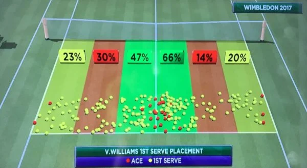
The 'little' of this design concerns the confusion that arises through careless colour choices. The specific subjects here relate to a pair of example charts used on TV during recent Wimbledon (BBC) and Cricket (Sky) coverage in the UK.
Imposed colours
The next and final ‘little’ in this week’s post concerns the use of colour and specifically the restrictions caused by the universal application of 'corporate' colour palettes. There are benefits from applying consistent colours to facilitate brand recognition but sometimes this can cause unnecessary obstruction.

Check out the next post on labelling conventions!
Interested in sage campus? Find out how your institution can get sage campus.