

This post is a guest blog by Charlie Joey Hadley, the instructor of the SAGE Campus Interactive Visualization with R online course that teaches the techniques and tools for presenting data in visually attractive and interactive ways in the R programming language. Charlie is a Research Technology Specialist at the University of Oxford specializing in data visualization.
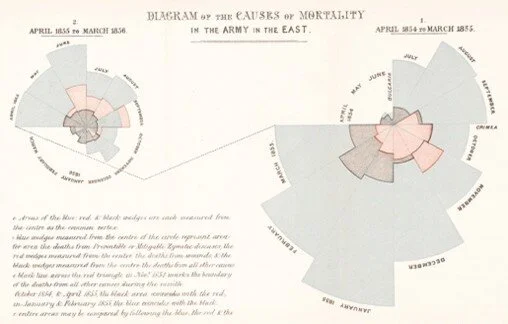
Data visualization is without doubt one of the most powerful tools for both telling data stories and grabbing the attention of your readers. My favorite historical dataviz example is Florence Nightingale’s use of polar area charts to demonstrate how simple sanitation techniques in hospitals could radically decrease avoidable deaths. The image to the left shows Nightingale’s charts and the BBC has an excellent overview of the impact of her statistically led healthcare reform and exactly how this unusual chart works.
Charts have changed a lot since the 1880s. Charts are now an intimate part of both the journalist’s and academic’s toolkit for communicating with readers. It’s often more a question of “which chart should I use?” instead of “should I use a chart?”. If you find yourself stuck with this question I highly recommend the Financial Times’ “Visual Vocabulary” (link downloads a PDF) which will help you choose between 60+ charts in common usage.
But something else has changed since then. We can now add interactivity to charts displayed on the web. I’d like to make the argument that (good) interactive charts are significantly more impactful and useful than static charts.
Just before you continue reading – please understand that you don’t need to be a fully-fledged web developer or even know any JavaScript to create truly impressive interactive charts. If you know – or are prepared to learn – a little bit of R you can create all sorts of different interactive dataviz. I’ll explain more after running through the benefits of interactivity.
Here’s a GIF I created of me using the interactive coronavirus tracker built by the Financial Times:

This image was made available by: Wellcome Collection CC BY 4.0
Let’s take you through the interactive features of the chart I used in the GIF and why they’re useful to a reader:
Filter for specific countries: before recording the GIF I selected the countries (France, Germany, Mexico and Sweden) that I was interested in and all other countries were set to grey.
Why? This allows readers to compare a subset of the data with the entire dataset.
Hiding unselected countries: I clicked on a toggle that hides the unselected (grey) countries
Why? This allows users to focus exclusively on comparing the series that are of interest to them.
Changing axes: I switched from the y-axis showing “deaths per 100k” to “raw numbers”
Why? In this specific case, many readers question why numbers are usually shown as “deaths per 100k”. By allowing users to switch dynamically between the two the reader can get a feel for the difference between these two metrics.
Hovering over lines for tooltips: I hover my cursor over each of the lines to show me the exact values for each series.
Why? Tooltips allows precise information to be communicated in a chart that couldn’t otherwise be shown.
Chart criticism: it would be more useful if the tooltip showed values for all series for each date, as this would allow us to compare absolute numbers for the countries we’re focused on.
Interactive charts allow readers to truly explore your datasets and better understand the messages that you designed your chart to communicate. In fact, when designing charts one of the biggest hurdles is making sure the chart isn’t too cluttered. Adding interactivity allows your readers to drill down into the parts of the datasets that are of interest to them.
It’s important to appreciate the GIF I made shows a fairly complex interactive dataviz – the complexity comes from the controls at the top of the chart for changing axes and filtering for specific countries. Most interactive dataviz have tooltips and toggles for adding/removing parts of the chart – often legend items can be clicked to achieve this.
So, I can make these with R?
R has two very different tools for creating interactive charts:
htmlwidgets: these are R packages for creating individual interactive charts and other dataviz. There are 120+ htmlwidget packages, but the best and most fully featured are summarised in this htmlwdigets showcase page. Any and all htmlwidgets can be displayed in an RMarkdown document… please see my other SAGE blogpost about the benefits of using RMarkdown in your work.
shiny: this R package allows anyone with intermediate R experience to create interactive dataviz of the same complexity as the FT coronavirus tracker I showed above. RStudio have an excellent gallery showing what can be done using shiny.
You don’t need to have ever written HTML, CSS or JavaScript to use these R tools to create interactive dataviz. As an example, check out the interactive parts of the Online Labour Index that I built with shiny, leaflet and highcharter.
Where can I learn more?
I’ve written a course for SAGE Campus dedicated to building Interactive Data Visualization with R. The course introduces everything you need to include interactive charts in RMarkdown documents and how to publish interactive dataviz to the web with shiny.